Infographics: Timeline of the Far Future
The infographic that I found detailed the predictions of events that will happen in the future. The images on the infographic are very effectively placed and the creator added a literal timeline to the image for viewers to follow. This…
Infographics: People of the World and Rape Conviction
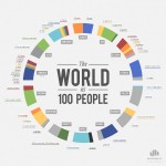
When looking at different infographics, I found that the one that stood out the most to me was the one titled “The World as 100 People.” The personal reasons this stood out to me was that it’s hard to put the…
Infographics: Caffeine and Calories
The infographic I found that I liked is called The Buzz vs The Bulge: Caffeine and Calories from Information is beautiful. This infographic compares the calories in common caffeinated beverages and foods in relation to each other, other food items,…

Infographics: Layout vs. Illustrations
I choose to focus on the infographic The World as 100 People. I choose this one because it tells so much information in a very easy to read statistical layout. The world has a population of over 7 billion people….
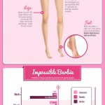
The World and Barbie
I think the “World as 100 people” is a powerful infographic. It is simple to understand, and I like that there is not a lot of text. The creator pulled out important statistics, but did not give the reader so…
The World’s Population Through Infographics
I believe that infographics are a great way to make vast numbers and incomprehensible data understandable. I chose “The World As 100 People” by Jack Hagley for precisely this reason. Learning about this data in terms of billions of people would…
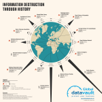
Infographic by Global Data Vault
The infographic above (can also be seen here) is a prefect example of portraying interesting information into an even more interesting manner. The company that published it, Global Data Vault, is using this infographic to promote the function of…
Infographics: A Simplistic Way To Relay Information
Out of all the infographics provided I found “The World as 100 People” to be the most compelling. I think that dividing the world into categories and simplifying the population to 100 people makes the information easy to absorb. The 100…
Infographics: Visual Design
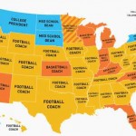
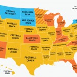
One of the provided infographics that really stood out to me was this one that illustrates who the highest paid public employee is in each state. The message it is trying to convey is that for a large majority of…
Infographics
Out of all the examples provided, my favorite was The Labor Force by Numbers. What makes a good infographic, according to the reading, is transparency, efficiency, and approachability. Part of the reason I liked this one so much was because…
Recent Comments