Infographics
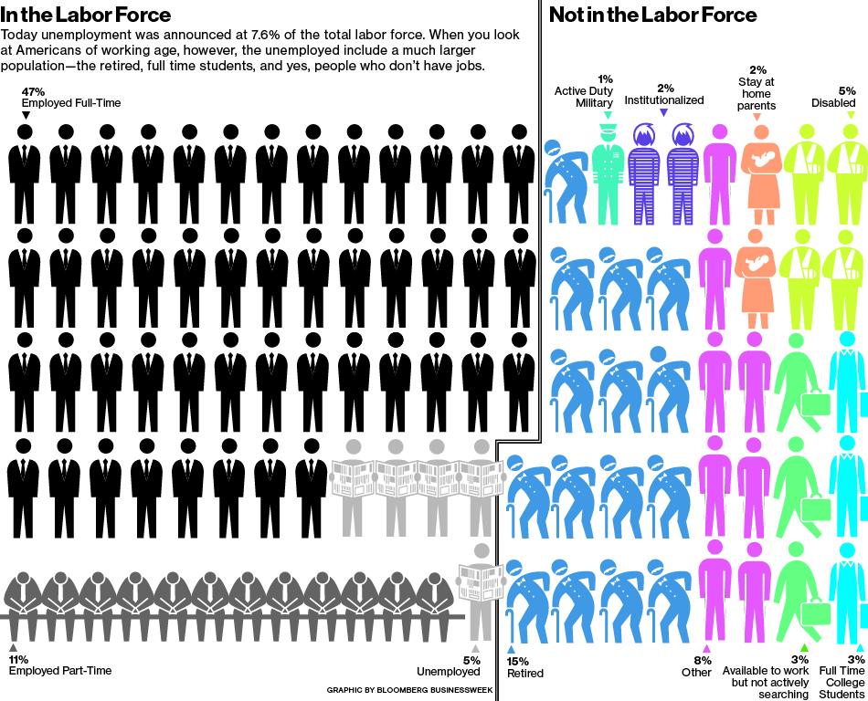
Out of all the examples provided, my favorite was The Labor Force by Numbers. What makes a good infographic, according to the reading, is transparency, efficiency, and approachability. Part of the reason I liked this one so much was because it was easy to understand. There is a clear division between those in and out of the labor force, and the color coordination makes it easy to comprehend which person is which. It is showing, not telling, me who is unemployed and employed by the different figures and colors, making it very pleasing to look at.
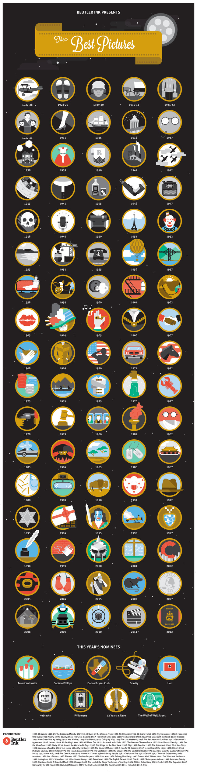
For my second infographic, I choose one from the site Information is Beautiful about the Academy Awards. I liked this one because of its simplicity: the infographic has simple drawings in reference to each year and the current years nominees. It is entertaining to look at, and although there are no oards describing what each movie from each year is about, you can clearly see it in the pictures. The pictures in the earlier years are in black and white while the pictures from the later years are in color, referencing the evolution of motion pictures as there is access to more and more technology. Some of the pictures are of lips, suggesting romance; others are of doglegs, suggesting war. Thus the infographic spans genres, making it more efficient and entertaining.
Overall, I think infographics are pleasing and efficient, because they can give you a good amount of information in a short period of time. They are informative yet aesthetically pleasing, making for an efficient way to gain information.
I agree with your point about simplicity. I took a look at the academy awards infographic, and was able to easily navigate the page and determine what the point was that they were trying to get across. Often times, simplicity is one of the most important aspects of an infographic because a reader that is lost will mot likely lose interest and not get whatever valuable information you are trying to get across.