Infographic by Global Data Vault
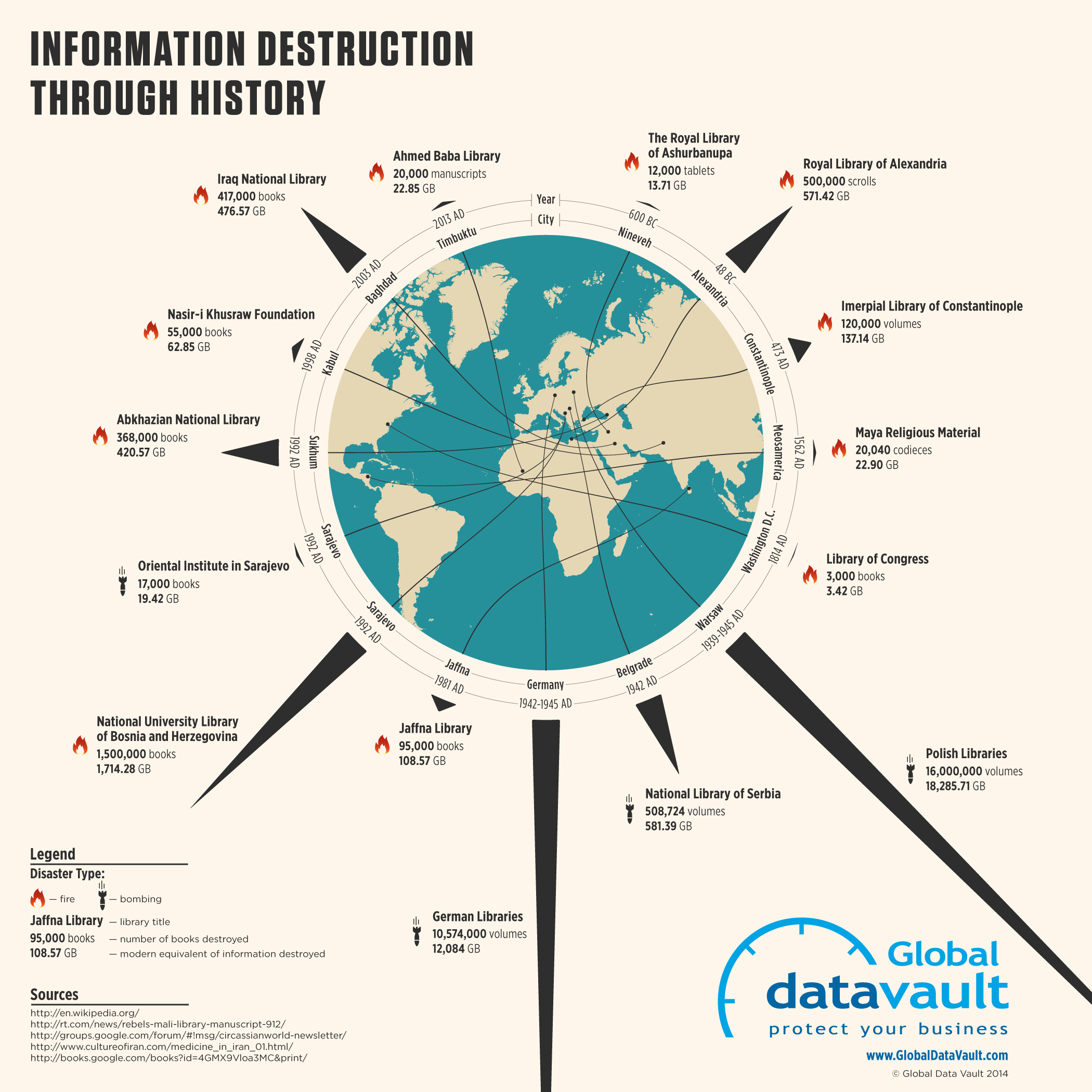
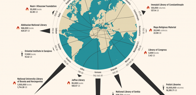
The infographic above (can also be seen here) is a prefect example of portraying interesting information into an even more interesting manner. The company that published it, Global Data Vault, is using this infographic to promote the function of their company (protecting valuable information). On this infographic, a globe is surrounded by incidents of information destruction that show exactly where on earth it happened. Whether it was arson or a bombing, incredible amounts of precious information was destroyed or lost. An interesting addition to this post was the conversion from the old medium of information (books, scrolls, etc.) to what we would use today (megabytes and gigabytes). For those who are familiar with the concept of digital data storage will know that an unimaginable amount of data was lost in each of these incidents. This infographic does a good job of promoting their message while providing the audience with a simple way to navigate the page and understand what is happening.
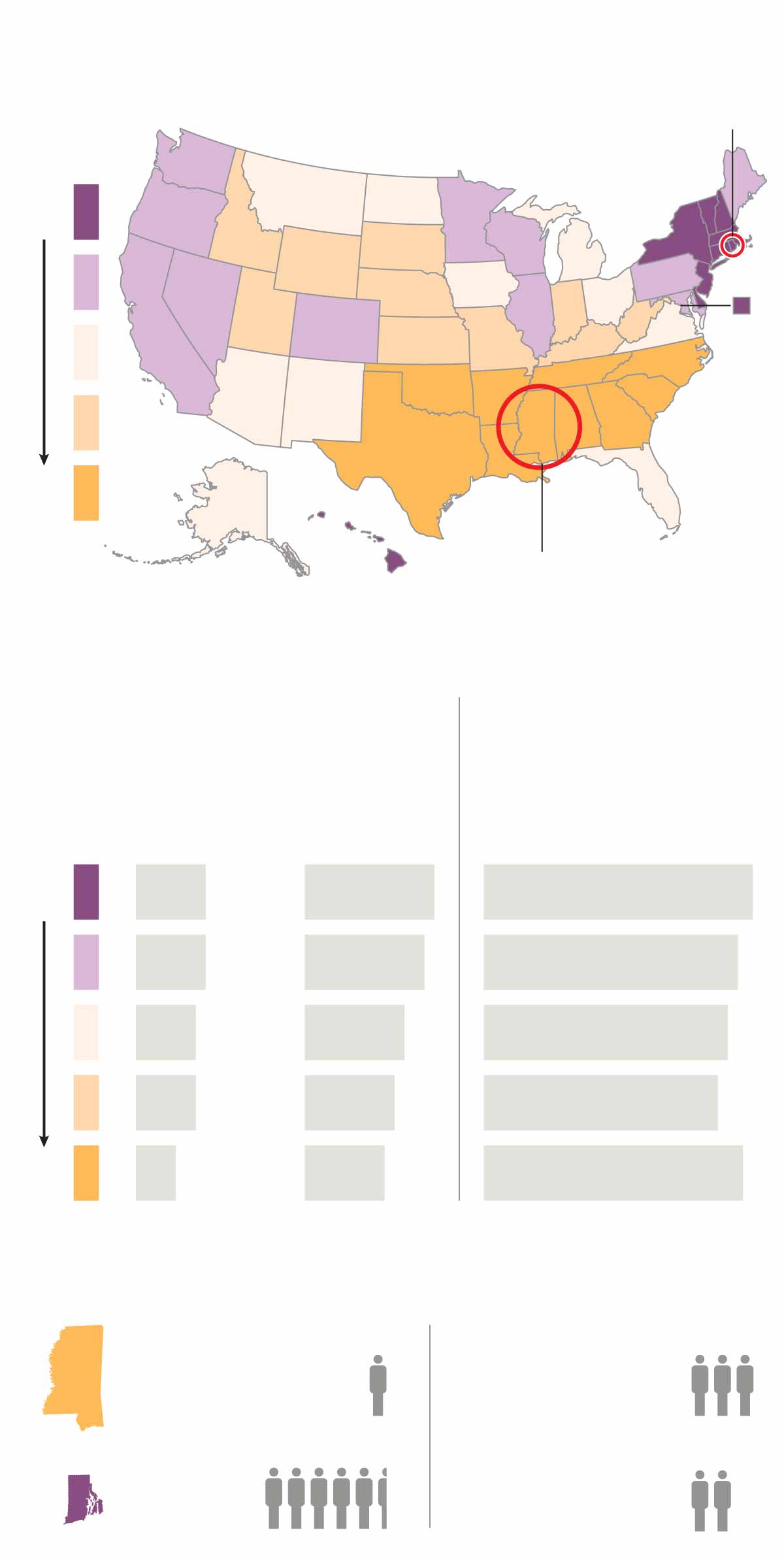
Out of the options we had to choose which one we thought was most effective, I chose the infographic on Tolerance of Gays in America. It takes an idea that often isn’t supported by numbers and statistics and does just that. It shows a trend of which states in America are the most intolerant to gays, and as most Americans would expect, the southern states are the least tolerant. This infographic also includes extra info about Mississippi specifically, stating that 50% more people searched “is my husband gay?” in Mississippi than in Rhode Island (the most tolerant state). This functions well because it provides numerical data regarding an issue that is currently controversial in this country. It will most likely draw the attention of a lot of people because of how it pertains to us as Americans, gay or straight. The most interesting part, however, is the trend of decrease in tolerance as you go further south.