Infographics: Layout vs. Illustrations
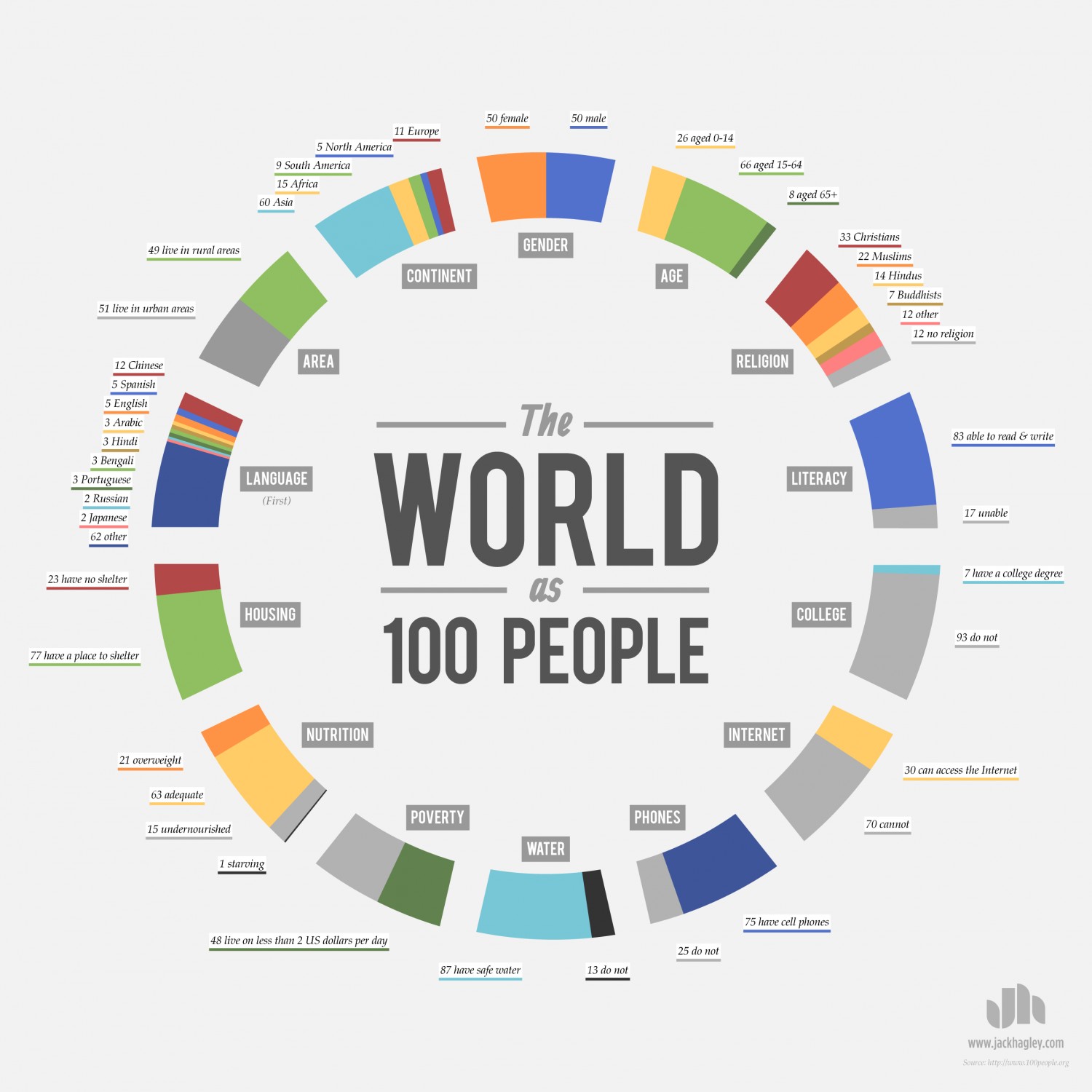
I choose to focus on the infographic The World as 100 People. I choose this one because it tells so much information in a very easy to read statistical layout. The world has a population of over 7 billion people. It’s very hard to imagine 7 billion people. What this graph does right is that it conveys an easy condensed number of people that have different religion, poverty levels, water access, and etc. that people can fully grasp and understand. It’s a lot easier to imagine 100 people than 7 billion people. This infographic also had a nice easy to read layout. It tells a lot of information without looking cluttered or overwhelming.
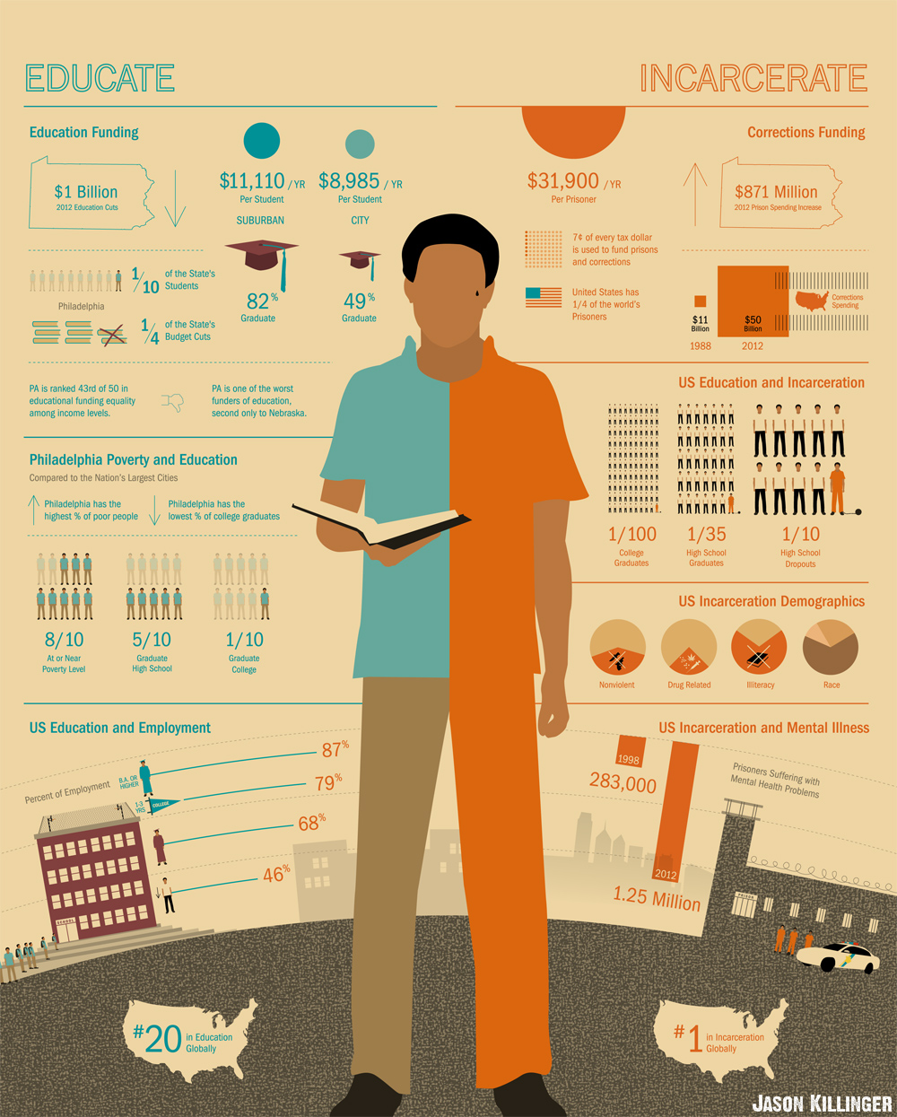
The second infographic I looked at was the schoolhouse vs jailhouse infographic. The first part I like about this infographic was the man in the middle. He is half dressed in a polo shirt and khakis and the other half is dressed in an orange jumpsuit. I liked this because it’s very easy for the reader to see which half is about education and which half is about jail time. It also uses many illustrations within it. It has a diploma cap and police cars. This again reflects the easiness to read as well as looking very nice.
Overall, I like the second infographic better than the first. The first tells a lot of easy information in a condensed form but its layout is kinda boring. Boring doesn’t always mean bad though. The easy to read layout works best for the information it is telling. The second one utilizes many illustrations that make it visually appealing to the audience.