The World’s Population Through Infographics
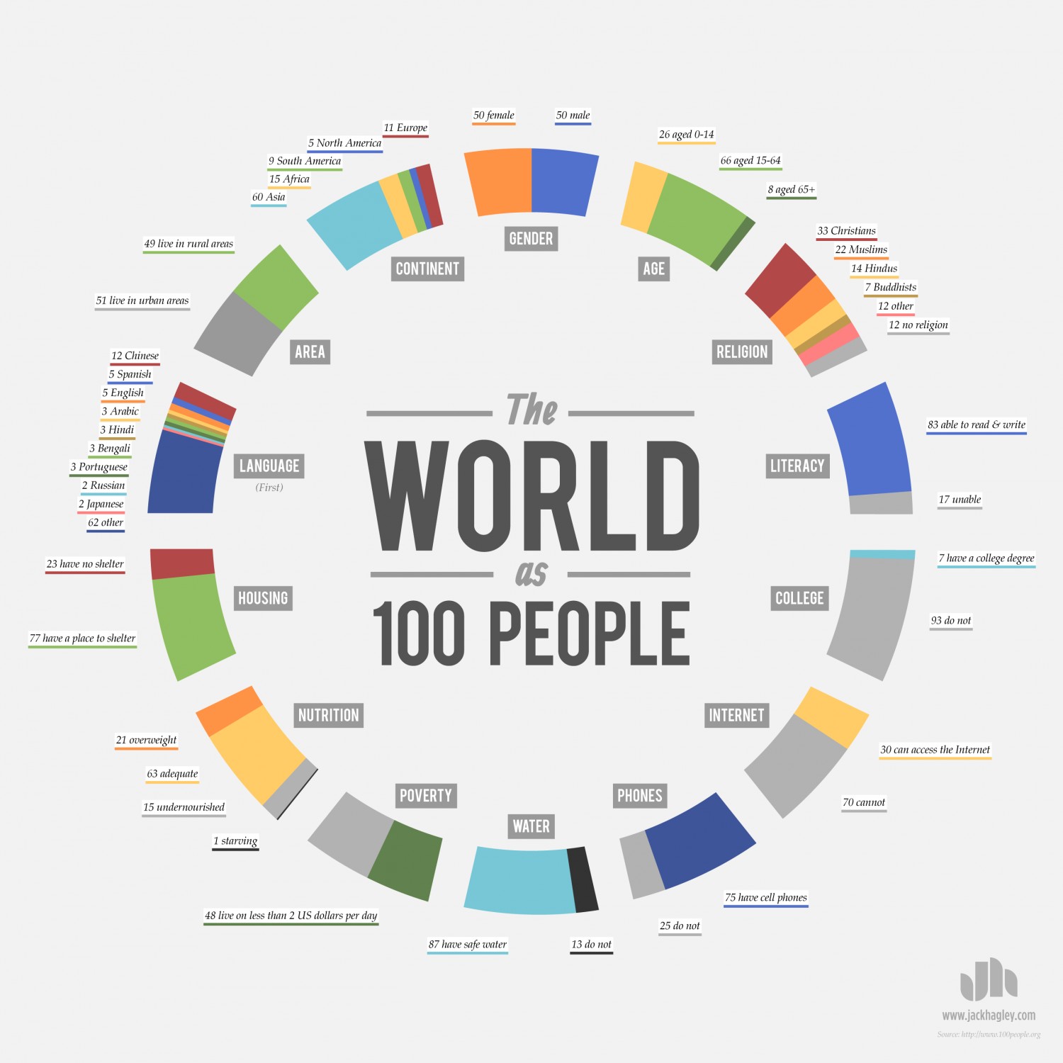
I believe that infographics are a great way to make vast numbers and incomprehensible data understandable. I chose “The World As 100 People” by Jack Hagley for precisely this reason. Learning about this data in terms of billions of people would not be easy to follow as we cannot comprehend seeing that many people at once. But it is easy to picture 100 people in a room together and visualize how they are different.
This infographic has many aspects besides the overall concept that make it effective. It is highly approachable for the common person. The circular shape mimics the shape of the world which makes it easy to see what the topic is. The shape and varying colors make it appealing to the eye and invite the viewer to read the statistics. Another aspect of its approachability and transparency is, as I mentioned above, the fact that the info is represented by only 100 people instead of billions. The infographic shows instead of tells the reader its info in the form of a long list or textbook page. The design is also efficient in that you can glance at it quickly and get a general sense of the data.

The second infographic I chose is called “How Much Food Nearly 7 Billion People Waste” by Aubrey Yee. I like that the design is straightforward and sticks to two colors, as it draws the attention to the actual facts. I also like the graphics throughout that liven up the text. This infographic starts off by asking the reader a big question, and then attempting to answer it by getting into more detail throughout. The first row gives the short answer, and the details are explored as you read on. I like this setup because, like the “Dear Mona” article, it gives readers the option of skimming.
Another effective aspect of this infographic is that it proposes some possible solutions to this problem. It then goes on to ask tell the reader how they can help. This definitely helps to engage the reader and make them feel like they could actively help solve this problem. If you were reading these facts on a textbook page, they would not be as compelling, and you would not feel quite as personally involved.