Infographics: Timeline of the Far Future
The infographic that I found detailed the predictions of events that will happen in the future. The images on the infographic are very effectively placed and the creator added a literal timeline to the image for viewers to follow. This timeline keeps the reader’s attention, causing them to continue viewing the graphic.

While the length of the image makes it effective for use as an entire webpage, it makes it difficult to embed into other websites. Despite this, the infographic was very effective. It presented interesting information in an interesting way.
In the infographic entitled “Is Your States Highest Paid Employee a Coach? (Probably),” the creator very effectively presents the readers with a question, and answers it.
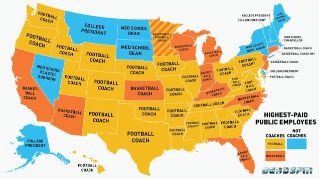 This infographic uses a map of the United States to make a point about the salaries of football coaches. It uses a familiar background image, and a variety of colors to present the information. This graphic is especially effective in the United States, where viewers look immediately to their state to see if it fits the question. The bluntness of the use of the words “Football Coach” also creates a repetition within the image that further drives the argument presented by the creator of the graphic.