Infographics: People of the World and Rape Conviction
When looking at different infographics, I found that the one that stood out the most to me was the one titled “The World as 100 People.” The personal reasons this stood out to me was that it’s hard to put the world into perspective sometimes because of the high population and the isolation that occurs within one’s own country.
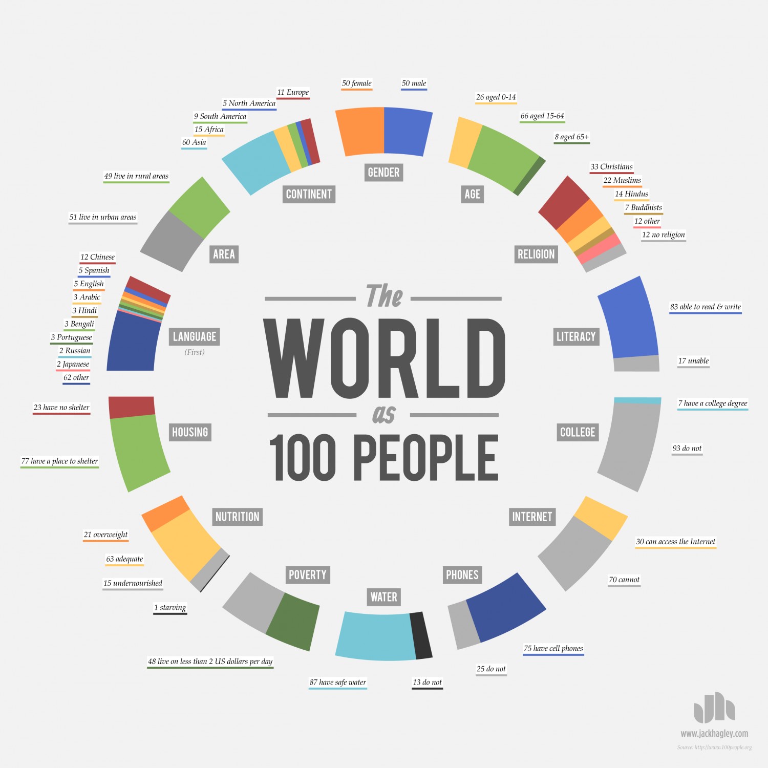
Putting the world’s population and characteristics into 100 people makes it easier to understand who inhabits our Earth and who our neighbors are.
The creator separated the different characteristics and shows how many people fit in different subcategories if there were only 100 people in the world. The fact that this information is organized in a circle further allows the viewer to absorb the information in a more orderly fashion (not to mention that it’s shaped like the world itself!).
The other inforgraphic which really affected me was one from Information is Beautiful. This infographic focuses on the number of rapes that occur in the UK and trickles down to show then the number reported, the number not prosecuted, the number prosecuted and then the number convicted. Branching off from these are different related statistics that further prove the point that rape is not receiving the attention it deserves.
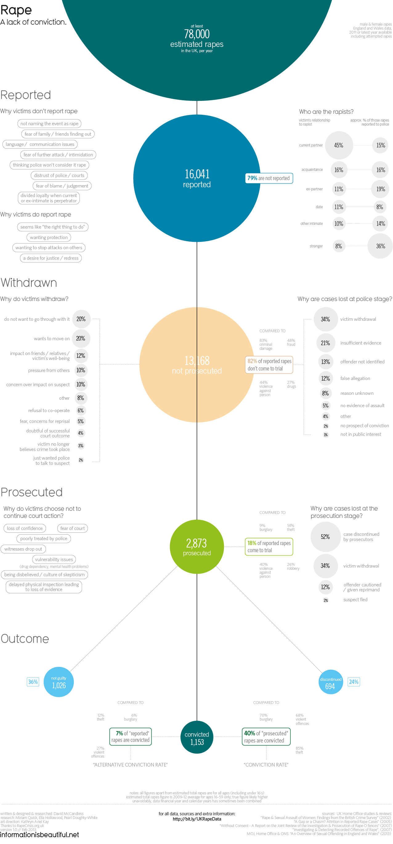
What helps to make this effective is the shape. The tier system forces the viewer to start at the top and move down seeing the processes after rape in a timeline. Each section of ‘branch information’ is directly next to the section it correlates to. The different colored circles let the viewer know that the information presented in that circle is different than the last. It also helps the graphic aesthetically.
What is important in an infographic is to draw in the eye of the viewer and to make it go where you want it to go in order to correctly receive the information.