Infographics: Caffeine and Calories
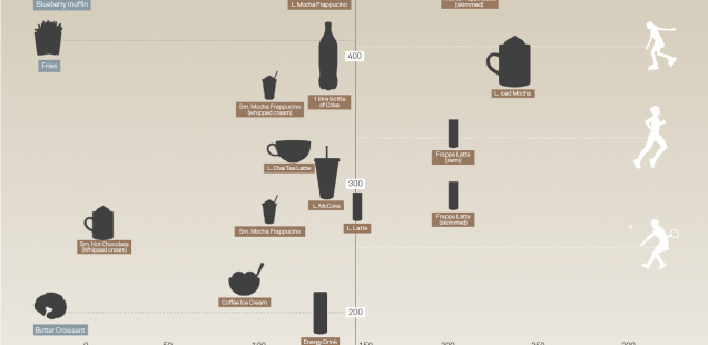
The infographic I found that I liked is called The Buzz vs The Bulge: Caffeine and Calories from Information is beautiful. This infographic compares the calories in common caffeinated beverages and foods in relation to each other, other food items, and what type of activity would be needed to burn off the calories consumed.
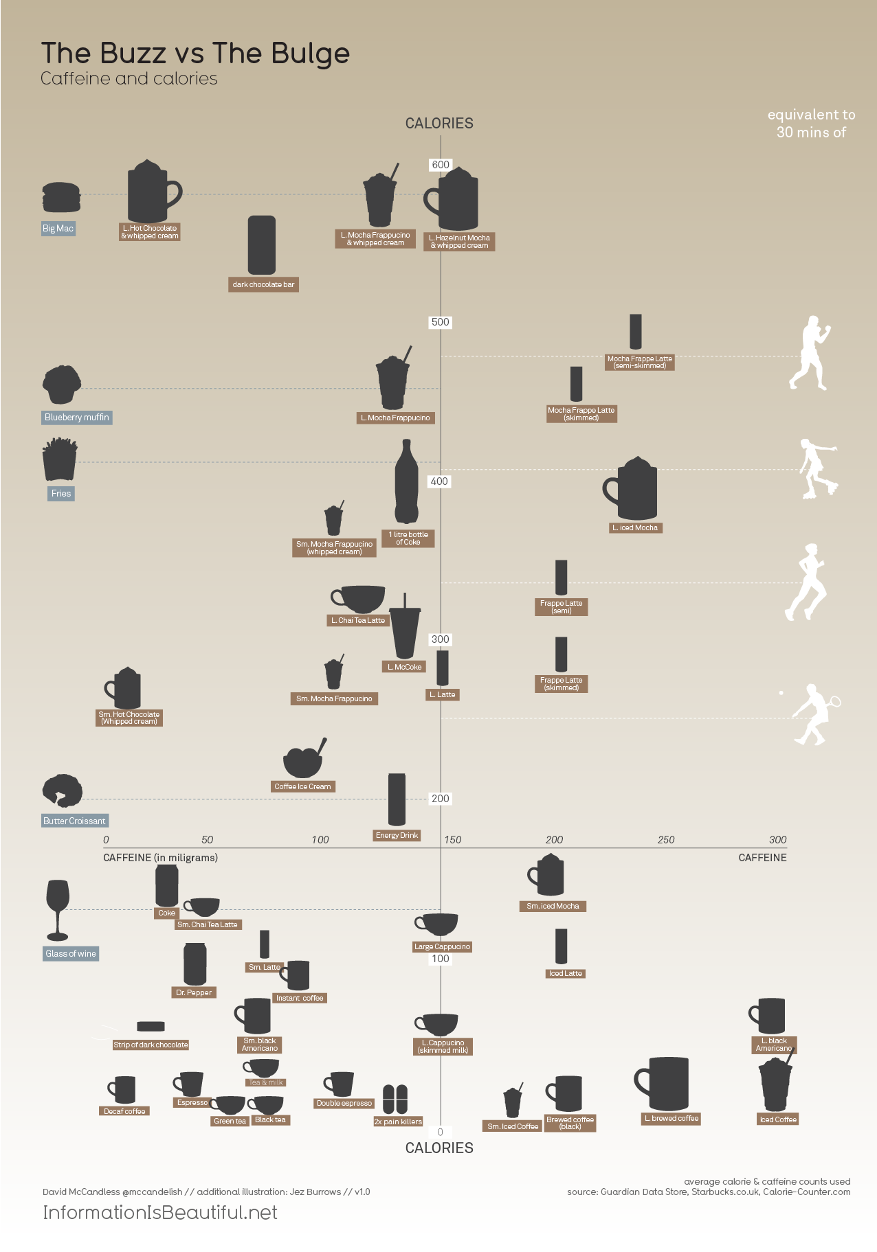
Something that I really liked about this infographic is how much information it contains. It compares many different food items and beverages but is still easy to follow. I think it was wise to display this information in the form of a graph and “plotting” food and beverages along the horizontal and vertical axes. I think this makes the information easy to understand and interpret. I also like the simple, muted color pallet. A simple color scheme brings the focus to the information while still providing a visually pleasing infographic.
The other infographic that I thought worked well was the Where the Closet Is Still Common example. It compares the tolerance of gays in states based on their support of gay marriage initiatives. My favorite part about this infographic is that it is very easy to understand and interpret. Some of the infographics I looked at took a bit of time to determine exactly what information was displayed. This one is very simple though. A map of the U.S. divided by states in an image most people are used to. Also, the key that shows what the colors mean is easy to understand. I think all together the map is a great and effective infographic.
This Where the Closet Is Still Common infographic contained other parts as well. The second part involves a little more text and reading, but is still easy to understand. I also like how they compare the public and private spheres of homosexual men among the most to least tolerant states. Again, for the third part, I like how they compare the difference between in school and at home openness of homosexuality. Another part of this infographic that I like is that it includes human figures to visually demonstrate the differences.