Infographics- Chicks rule?
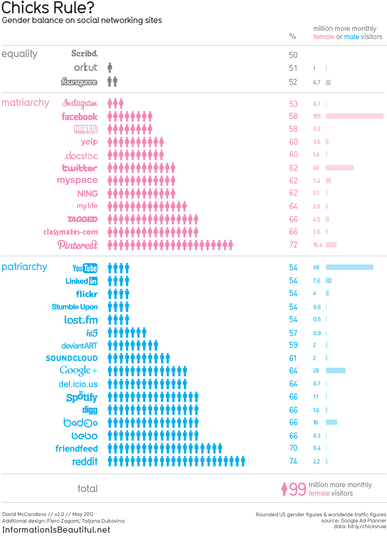
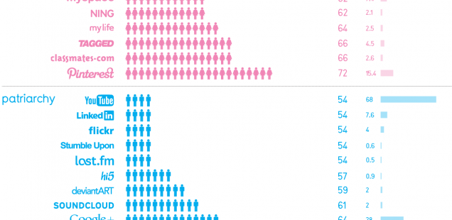
I liked this infographic because it displayed information in a simple, yet meaningful way. It also wasn’t boring to look at. It is displaying the ratio of boys to girls on social media apps. It shows apps that are used equally by both genders, then apps used most by girls, and apps used more by boys. The use of pink and blue helps you to easily distinguish between boys and girls, limiting the amount of information you have to read. They also use the trademarks of each social media app. It is easier to identify these symbols we are used to seeing everyday. Overall, girls use social media apps more than boys, which is shown at the bottom of the chart.
I also liked the 100 People infographic. The circle shape was a smart idea because we often associate circles with pie charts, which usually add up to 100, or a whole. The use of different colors made the different categories easy to distinguish from one another. It was visually appealing. The sections were interesting, but there were not too many that I felt overwhelmed or bored. The information was eye opening which also helped to grab my attention.
I chose both of these info graphics as well! I think the main thing that have in common that helps their visual appeal is the colors they both use. The pink and blue were really well used in the “Chick’s Rule” infographic as well as the boy and girl symbols. I think the colors in “The World As 100 People” really help to separate the categories and the individual group of people each category is referring to. I agree that after the first few categories I looked at I got bored. There was so much information crammed in to such a small area that it was hard to take it all in.