Infographics: Fish & People
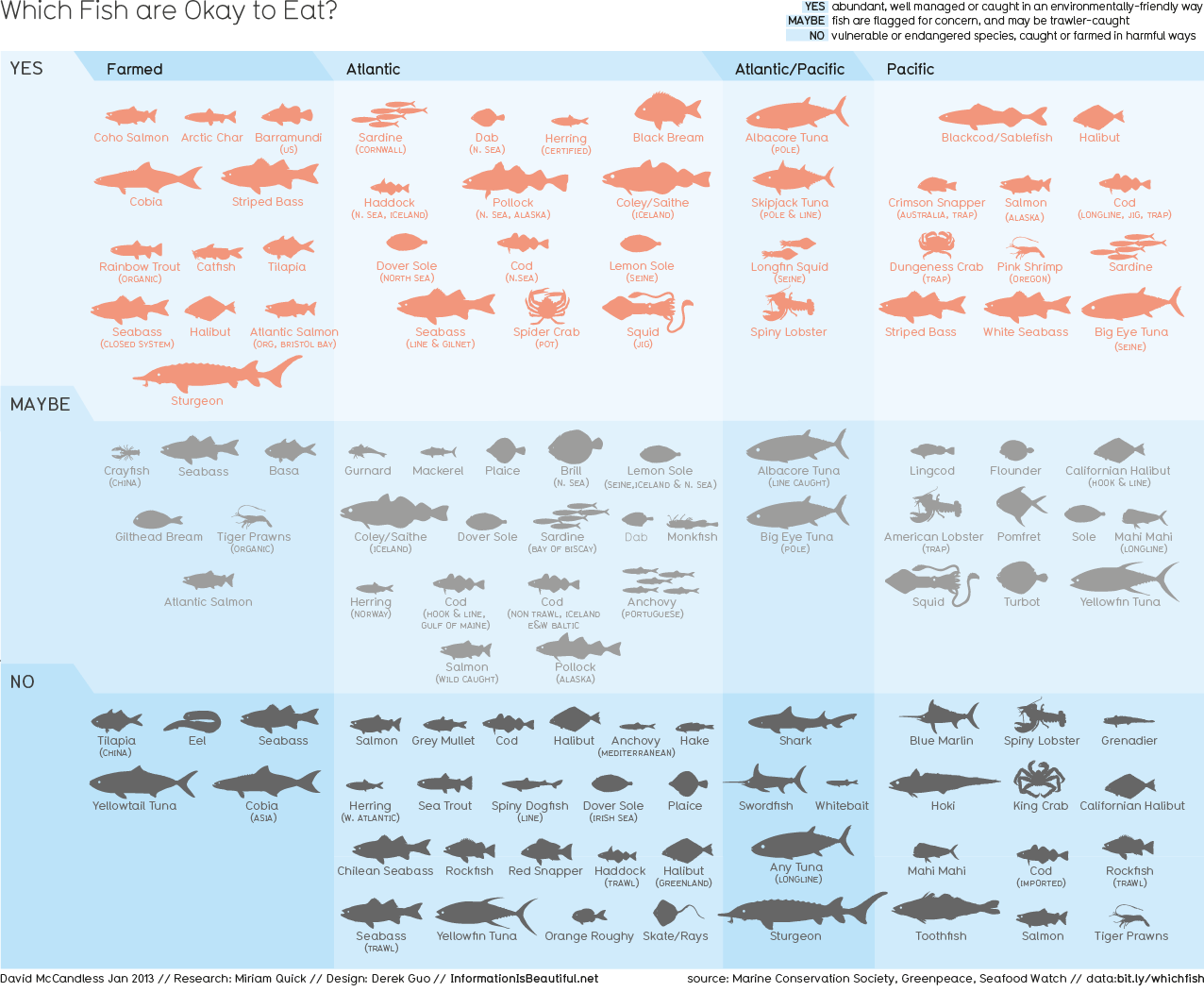
The infographic I found that most intrigued me is from informationisbeautiful.net and is a depiction of which fish are okay to eat. I was attracted to this infographic because of its relevance to my own life, as I LOVE to eat fish, especially when sushi is involved. I have also heard lots about fishing restrictions over the past few years, but many of the stories you read on improper fishing are complex and confusing. This infographic by David McCandless, however, presents the world of good and bad fishing very simply. You might not realize at first, but McCandless starts with a straightforward y-axis and x-axis. There are a few divides along the axis, but it is still a vertical and horizontal axis meant to simplify the information being presented. Moving forward, the infographic does an outstanding job of balancing between detailed and simplistic. McCandless chose to present each type of fish with its silhoutte to provide some detail and specificity, but leaves out the color of the fish and other visual details because those aspects are unneccesary for his purpose. In other words, the detail is not overwhelming. The divide between sections by color is also employed quite well here. Again, the color use is not overdone. This infographic is successful because it is presenting a complex set of information in a less complex way that can read and understood by all.
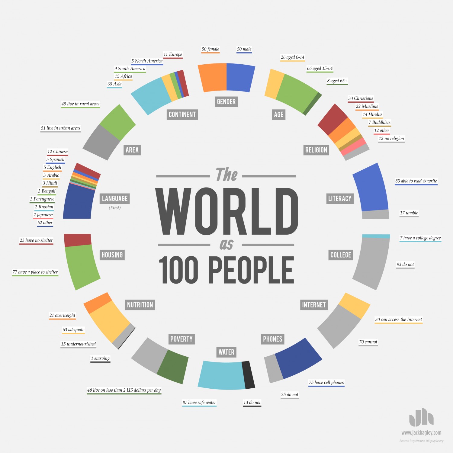
The infographic I liked most from the list is the “The World as 100 People” image. I have a particular appeal to this one because of the strong employment of a circle. After looking over a lot of these infographics, it became clear to me that a circle is a commonly used shape due to its versatility. It can be altered or divided in countless ways to deliver a message. “The World as 100 People” is a great example of the versatility of a circle because there are 14 different sections on the inner layer, then 44 sections on the outer layer. The message is still clear, even with the increase of sections, because you look at each section individually. So, while the numbers increase, you’re attention is still confined. This infographic is also successful because it appeals to a large mass of people. It covers a broad topic, rather than a specific topic like the fish infographic. The fish infographic is still successful, but the 100 people infographic does a better job at appealing to a broader audience.