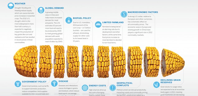
Infographics: Food Price Facts
An infographic I found interesting was one about the facts behind food prices. What I liked about this infographic was that it is very simple. There is a title, an image of a piece of corn, and the facts spread out around it. Each piece of information has a title that is in bold and then more information underneath it. I like this design because it allows you to the broad idea and then it provides more information if you are interested in finding out a little bit more about the topic. I also like the colors that are used in this infographic. The simple colors allow the viewer to focus on the facts which are what is important.
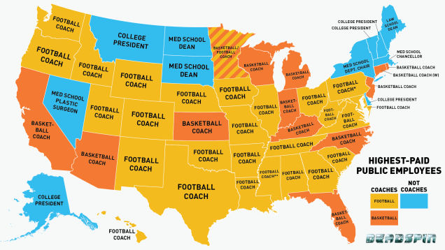
The infographic from the list that I liked the most was the one about the salaries of coaches. This infographic is interesting because it shows a map of the United States with the title of the public position that earns the most in the center of each state. This infographic is effective because it groups the different positions by color so that you can easily see that the highest paid public employees in the majority of the states are coaches.