Where You Lay Your Head is Not Always a Bed
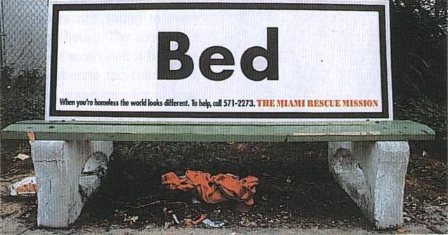 This ad focuses on a very prevalent public issue, homelessness. According to www.nationalhomeless.org, the number of homeless people in the United States is rising due to the recent foreclosure crisis. The audience of this ad could be people who view it on the internet, or people who walk past and see this particular bench. Pathos is used to appeal to viewer’s emotions. The viewers are meant to feel bad after seeing where homeless people sleep in comparison to their comfortable beds at home. Ethos is also used here since The Miami Rescue Mission is printed on the ad. Credibility is established since an organization is involved.
Although the design of the ad is simple, it is still very effective. Having “bed” in a very large font size and center aligned draws emphasis to the word. Making the colors primarily black and white with an accent of red also allows attention to be drawn to the organization. Overall the ad does a very nice job at getting its message across and drawing attention to the issue.
Image from: http://academicfactory.wordpress.com/2012/02/20/introduction-to-visual-rhetoric/
I think this ad does a great job of conveying its message as well. Do you know if it is just a picture someone created on the computer, or if this ad was actually placed on benches in urban areas? I think that by placing this ad on benches it would do an even better job of conveying the message because of the amount of people that would see it. The basic design would really catch the eye of many people passing by those benches.