Are Children Growing Up Too Fast?
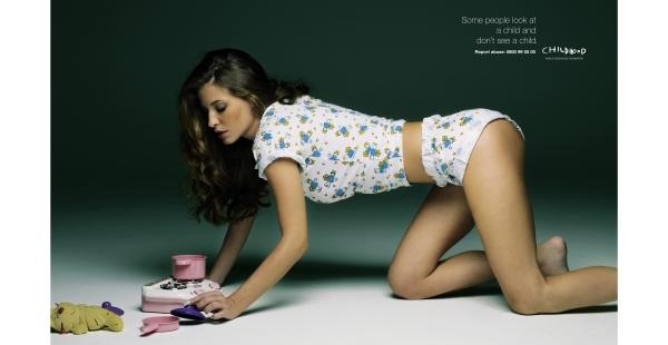
I really liked this visual argument, mostly because it focuses on a public issue I feel like we overlook a lot of the time: children growing up too fast. The audience in this picture is clearly everyone, even if you do not have kids yourself. For example, you can be a photographer who is snapping pictures of celebrity children or a regular person buying the magazine that they are in, subsequently supporting celebrity children being bombarded by paparazzi. You can be a pageant coach for a six year old and have her perform a “sexy” dance for the talent portion, or be a regular person supporting that choreographer by watching TLC. There are no statistics or numbers here, ruling out the heavy use of logos. There is, however, some ethos, seen through the name of the organization printed in the corner of the picture and the fine print below. I cannot tell what the organization is because the font is too blurry, but the picture does nonetheless give the audience power to look it up for themselves. Pathos is definitely evident in this visual argument, seen in the way the organization portrays the model. When I look at this picture the clothes and toys tell me she is an innocent girl, however the seductive pose, makeup, and skin showing make her an oversexualized women. She is a girl trapped in a women’s body, making me not only sympathize with her but also feel frustration for every other child that suffers the same fate.
In terms of visual design, the argument is well thought out. The emphasis is clearly not on the words but instead on the model. This works because the words technically don’t need to be there; just looking at the model can tell someone what this ad is all about. The words are for repetition, echoing our thoughts and clarifying the purpose of the argument. What the words say rings true in our society: we do not see a child when we look at a child. We see them as “money makers” or “models,” all under pressure from the entertainment industry to look pretty and skinny and perfect. In terms of color and font, the spotlight on the model and the dark background once again serve to emphasis the model. The fact that white is seen as more of an innocent color works perfectly with the “innocent girl” theme, while the spotlight illustrates the power that the media and entertainment industry play in this issue. The font is simple and clean, something that does not attract a lot of attention, and the white once again brings back the idea of preserving childhood innocence rather than rushing through it. Finally, the position of the words in the corner once again lets the audience focus on the model, and the fact that there are no other words around her once again creates less distraction. Overall, everything is very clear cut and neat.
Picture source:
http://delhagencc2.weebly.com/uploads/1/8/4/6/18469126/8916968_orig.jpg
This ad immediately caught my attention, mainly because it is just such a strange picture. The image made me feel uncomfortable. It really caused me to stop and think about the message behind it. For that reason, I think it is very successful in making its point. I agree that the addition of large text to this ad would deter from the overall effect. The phrase, “A picture is worth a thousand words” definitely applies here.