Infographic: IBD
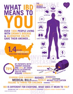
The readings about info graphics were very interesting. An infographic related to my topic, IBD, that I find incredibly appealing and informational is one by The Crohn’s Journey Foundation. In terms of information design, I believe this one truly succeeds. As The Best American Infographics indicates, the best ones think visually and spatially. This infographic is easy on the eye, using colors that complement each other yet distinctly represent the issue at hand. It is proportional and efficient. Looking at the infographic I am immediately draw to the words, “What IBD Means to You”. It incorporates statistics, images, and uses careful and powerful use of text.
After taking time to review the graphic, I feel as though I know what a patient with IBD experiences (regardless of my personal bias). Taking my own bias into account, I think this does a fabulous job depicting IBD.
Given the examples, my favorite infographic is the one focused on cosmetic surgery. There are many different aspects I like about it. First and foremost, it is incredibly information. After taking time to review the infographic I learned a lot more about Plastic Surgery than I knew before. I like the use of colors, as they aren’t overbearing but they highlight the important aspects. The body in the middle is light enough to draw the eye to it. It is organized, and does not have an overwhelming amount of text. It also includes statistics and facts to shed light on the topic at hand. I am incredibly impressed by both the design and the information the infographic provides.