The World and Barbie
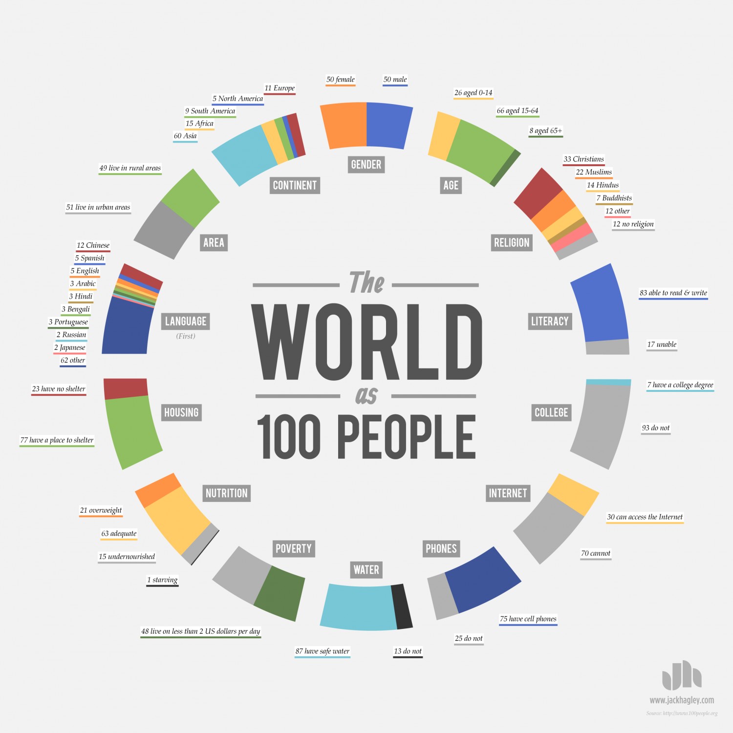
I think the “World as 100 people” is a powerful infographic. It is simple to understand, and I like that there is not a lot of text. The creator pulled out important statistics, but did not give the reader so many that it was overwhelming for the eye so it has the right balance and is efficient. The colors used are pleasing, and the color distinction between the different statistics is clear. Because the words for the statistics are placed close together, my eyes are able to group them together. My eyes were immediately drawn to the text in the center, and specifically the words “world” and “100 people.”
The second infographic I looked at is definitely addressed to girls and young women because of it’s pink and purple colors. I like the visual comparison between Barbie and a Real Woman because I think it strongly puts across the message of impossible standards of beauty that women have. Also the graph listing US average sizes compared to Barbie’s body parts is simple and easy to understand. My eye’s were first drawn to the word “Barbie” in the upper left hand corner because it is the biggest text and also because my eyes are familiar with the “Barbie” logo.
The second page points to body parts on Barbie that would be physically impossible for a real life person to have. The last page looks at the probability of finding “Barbie size” body parts in the general population, looking specifically at Anorexics, Models, and Barbie. I thought this graph was a little bit harder to understand, but I thought comparing Barbie to anorexic and models sent an effective message.
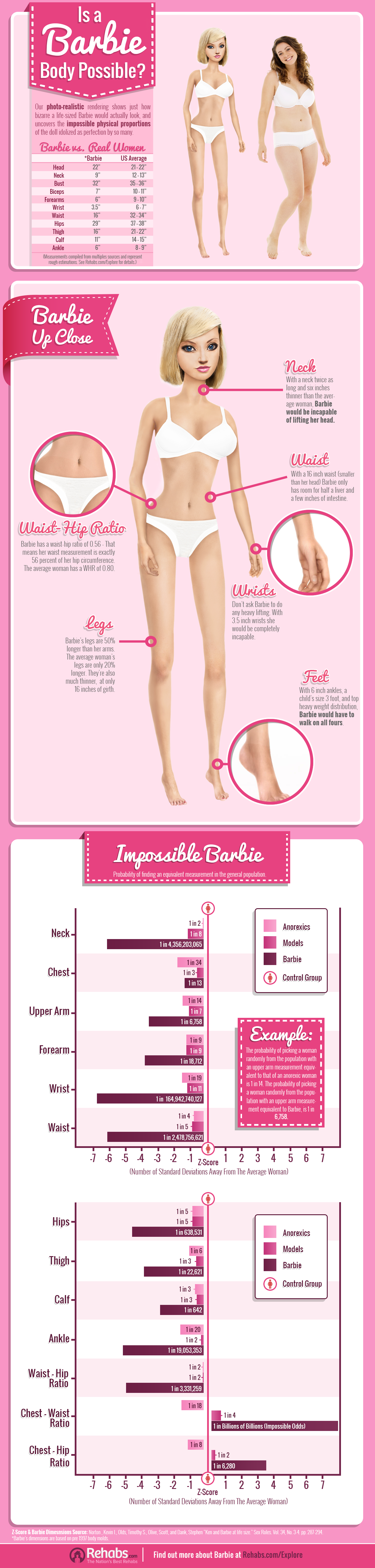
I really enjoyed the Barbie infographic you found. It would be a great resource for me to use for my public issue! I agree with you and also think the last page is harder to understand but still includes great information. I also think the colors in this infographic are effective because they are the iconic Barbie pink. I think it’s clever that the creator used Barbie’s colors while degrading the doll.