Infographics: Visual Design
One of the provided infographics that really stood out to me was this one that illustrates who the highest paid public employee is in each state. The message it is trying to convey is that for a large majority of the states, the highest paid employee is a coach. I like how the infographic conveys this in a very simple manner. The only image it contains is a map of the US and only uses 3 different colors. These colors however contrast enough that you can easily tell a difference between them. I also like how that while the basketball and football coach states have different colors, they are also closely related using a yellow and an orange. However, the non-coaching jobs use a bright blue color showing a much greater contrast from the coaching states. This is done to really amplify the message that the majority of the states have their highest paying job as a coach of some kind.
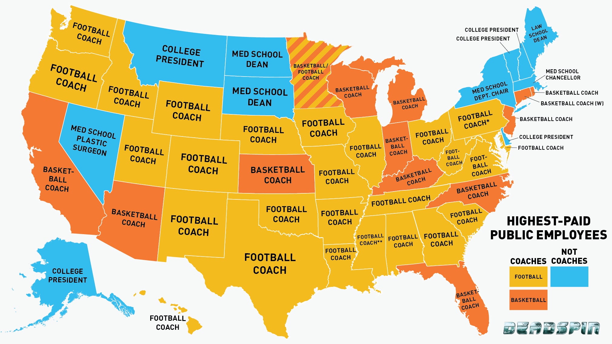
http://i.kinja-img.com/gawker-media/image/upload/ykdkqhstdm1ptubyuct2.jpg
The Second infographic I chose really stuck out to me because of all the recent talk in the media the past few years about different types of contagious flus that have been affecting the human population. This graphic uses the Venn diagram, which is a very common visual recognized by most viewers. The choice of this design does a very good job in conveying the message. It allows for the different strains of flu to be grouped with what animals can catch which flu strains. Different color are used to distinguish between the different animals. The author of this infographic then took it a step further and changed the text of each flu strain to further convey its message. The size of the text indicates how great the human fatality rate of each strain is. The lighter the text of the strain name, the less likely humans are to get infected with that particular strain. I feel like this does a great job in allowing this particular graphic to contain more information without over-complicating the design. I feel like the combination of all these design choices provides for a very powerful infographic.

http://infobeautiful3.s3.amazonaws.com/2013/04/1276_influ-venn-za6.png
I agree with what you said about both infographics. I think color is one of the most important aspects as it immediately draws the viewer’s eye and helps them differentiate between different categories. In the second one, I like how the darkness and size of the text conveys important information, because it combines a visual and textual way to convey the facts. I also like how both infographics used a framework that is very familiar to us: the U.S. map and the Venn Diagram.