Infographics: Simplifying the Complex
Infographics are a great way to display important information and statistics in a way that helps the audience visualize the numbers. Being about to see proportions and comparisons gives the audience a higher degree of understanding.
I looked at the “Who Works and Who Doesn’t: The Labor Force by the Numbers” infographic and the “Water Down” infographic.
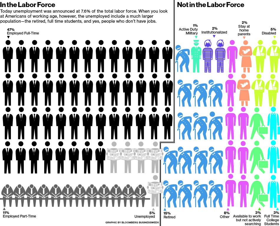
The employment graphic stood out to me because of its simplicity. The people are all visually similar but separated with different colors. There is a clear distinction between those in the labor force and those not in the labor force. I found it how much of the potential workforce is retired. I was also surprised that only 3% of the potential workforce is full time college students.
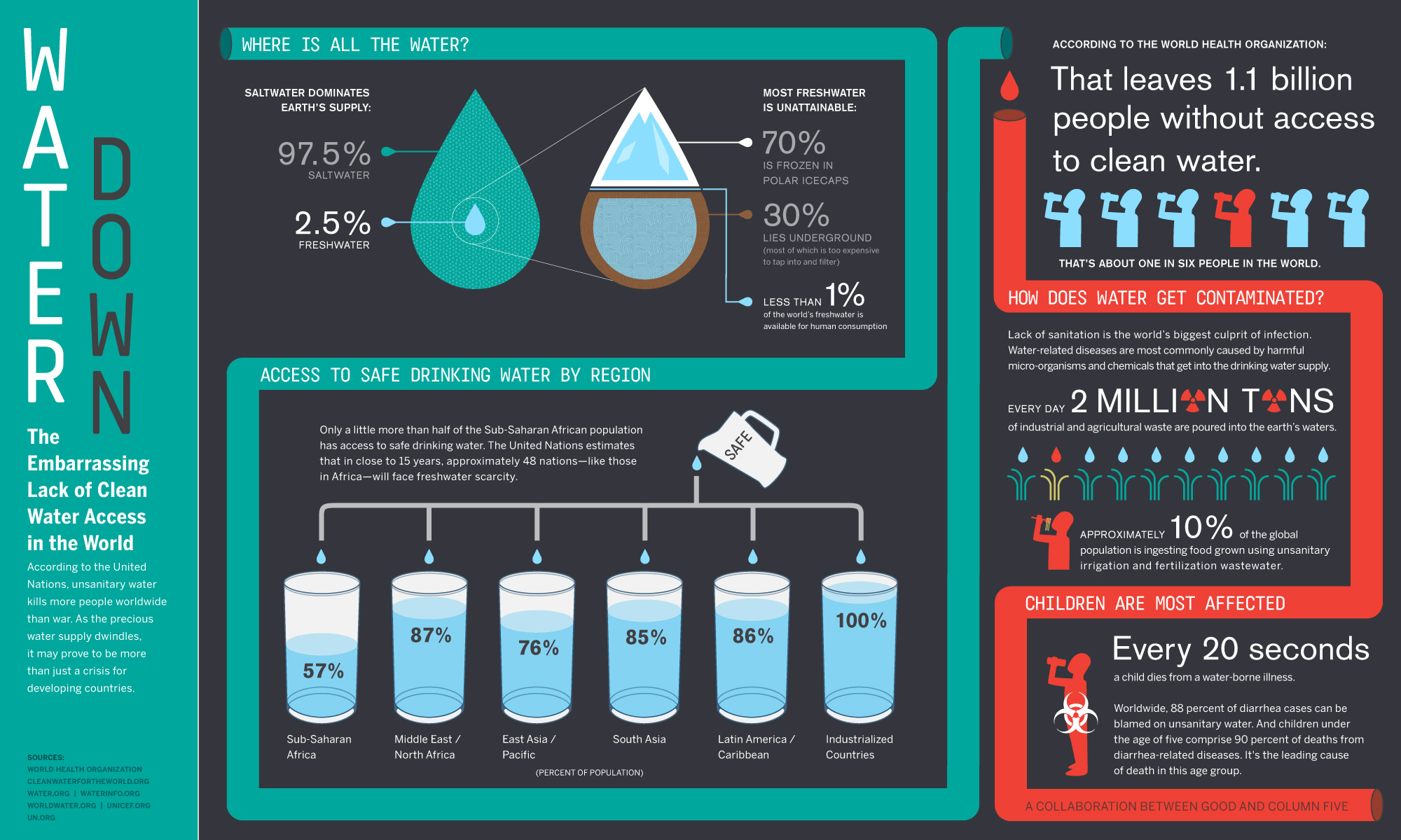
The water infographic stood out to me because it has a distinct flow. It also has many different layers with continuously more detailed information. The graphics are very effective because they show the proportions and comparisons well. The piping element that flows throughout the diagram helps to guide the viewer through the information. The flow is from a broad view of water to a narrow result of children who die as a result of drinking unsafe water. It helps the logical flow of information.
Infographics are an interesting way to keep the audiences attention and explain a lot of information in a short space. Keeping the visuals simple and meaningful helps the audience to take in all the information.
I agree with you and think that both of these infographics are put together really well and do a good job at conveying their message. I really like the graphic on water. I like the way the pipe design sort of leads your eyes around the graphic in a specific order. This allows the message being delivered by the graphic to start off very broad and then breaks it down into smaller parts. I also like the contrasting colors of blue and red. I feel that these help divide the graphic into two distinct parts, one dealing with just general water facts, and the other dealing with the dangers of contaminated water.
I like how the first infographic displays its message in a very simple format. It uses repeated images and a few different colors that allow it to still convey the message without it being too visually overwhelming or complex.