Got Milk? An unforgettable visual argument/public issue campaign.
For my visual argument example, I chose a classic “Got Milk” printed commercial from the 2006 campaign Body by Milk. The campaign lasted for many years and I have lots of confidence that most people have seen an ad for the campaign. The Albert Pujols rendition I chose is a great example of a successful visual argument for a public issue.
In 2006, the Body by Milk campaign was born due to the alarmingly low levels of teenagers consuming milk on a daily basis. Here is a New York Times article explaining how the campaign found its roots and the method through which it appealed to the public youth. Ethos, logos, and pathos are prevalent in all of these visuals, but the Albert Pujols version is a good example to use.
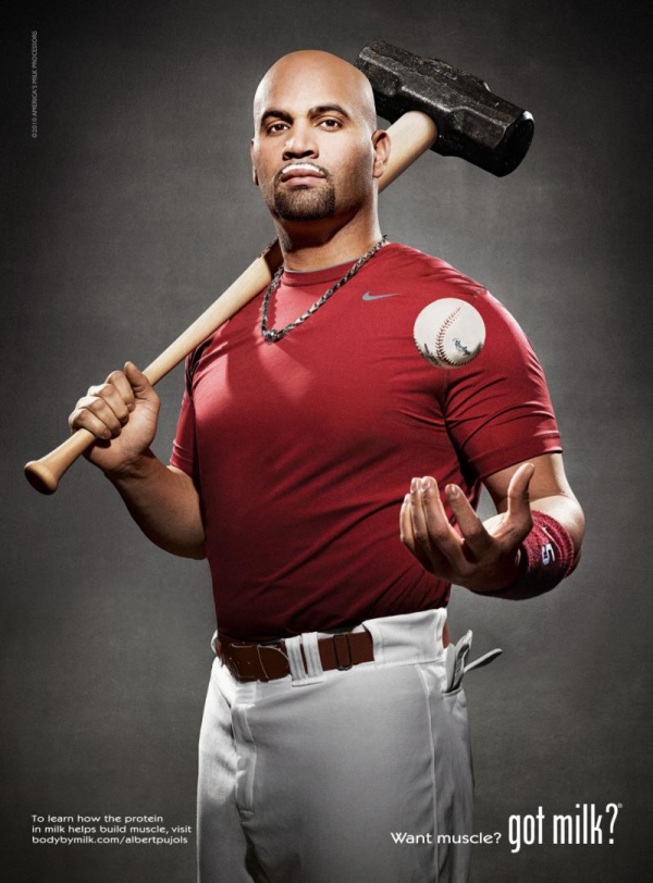
Ethos: Pujols was one of the top five baseball players in the country at the time of this ad, and was seen as the face of baseball for quite some time. Any average teenager who either followed baseball or sports in general would recognize who this man was. He’s also displayed in his baseball gear, so he is clearly a big time ball player.
Pathos: Pujols has also always been seen as a great guy for the community. He is known for having a great relationship with his family and his city. Pujols has also never been under the scrutiny of the steroid cloud. Using him, and not Barry Bonds, for example, provides the audience with an emotional connection. Pujols is an all around great guy, and he drinks milk, so I should drink milk.
Logos: Pujols is a slugger, and the teenage baseball fans know this. This is similar to pathos; since Pujols cracks home runs on a daily basis, and he drinks milk, then I must also drink milk.
From a visual standpoint, this ad is put together perfectly. It is as simplistic as possible while still holding a strong message. Emphasis is put on his power by attaching a sledgehammer head to his bat. Emphasis is also put on his health by displaying Pujols in an upright position, which shows his strong, well-postured body. The key piece of visual argument, however, is found in the alignment. The placement of the slight milk residue on his lips shows THIS MAN DRINKS MILK. All of these ads had the same alignment, which was their essential universal feature. The alignment is meant to show that right before he goes out slugging baseballs over the fence, he has a glass of milk.