
Infographics for Every Topic
I should start by saying that I love infographics. They are (in my opinion) one of the most compelling and interesting way to present information and infographics make the information they present very memorable.
Of the examples provided, my favorite was ‘The World in 100 People’. The Introduction to The Best American Infographics 2014 book said an infographic should be efficient, clear, and understandable when presenting details. The World in 100 People graphic succeeded on all of these fronts. Not only was it interesting to see the world’s population divided into these various sectors, the image provided a clear and unique overview of the information at hand.
Looking through the various infographics reminded me of an online shop called Pop Chart Lab. I buy a lot of Christmas presents from this site, and one of the things that they sell a lot of are shirts and posters of fun infographics. One of my favorite examples sis shown below.
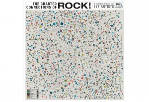
The above example shows 727 Rock musicians/artists and how they are connected. This web also reminds me of a similar infographic featured in the film School of Rock, when the main character draws a ‘History of Rock’ chart on the blackboard.

Infographics in general are fun because they can be used to depict facts about any topic in a way that is engaging and more entertaining than the same information would be if simply listed in text. I look forward to seeing what the class comes up with for our infographic assignment.
I agree that infographics are a more entertaining and fun way to show data. They keep your interest better than just a bulleted list or plain text, especially when they are clear and easy to read. Also, School of Rock is an awesome movie.
I agree as well. Infographics are fun to look at and an easy way to gain information, especially if they are colorful. They draw your eyes more than a textbook or a huge paragraph of words. I really like your second one, because it reminds me of a web with colorful dots on it. It seems simple when you first look at it but is actually really intricate, which I like.