Infographics: Showing Data Visually
I looked at two different infographics that I believe did a good job of conveying information and data visually. The first one was called The World as 100 People and the second was called Armed to the Teeth. There were some things that both of these infographics did well, such as the way they both showed a lot of information while still being visually appealing and easy to understand.
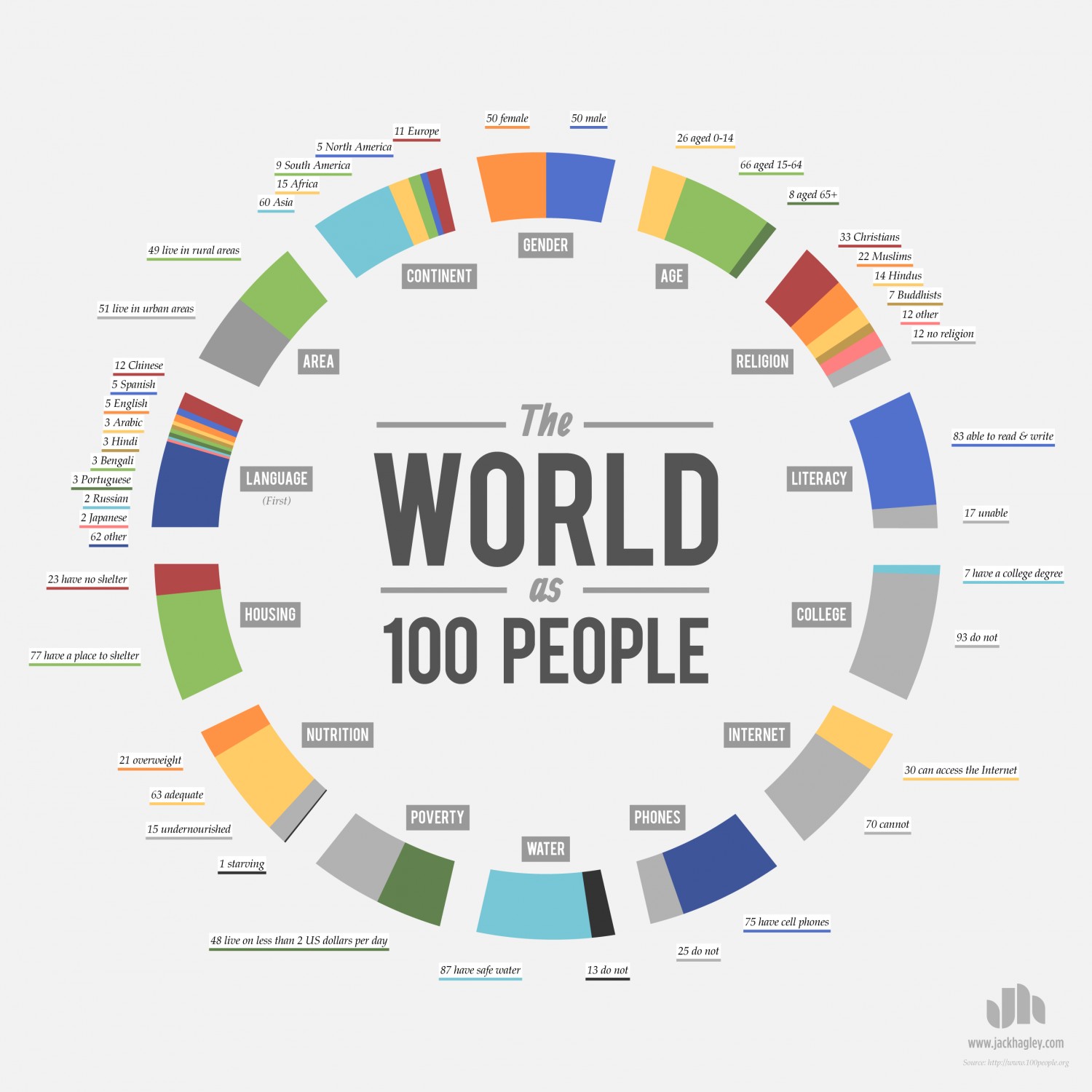
The World as 100 People was from the website visual.ly. It took aspects of human life such as language, religion, and housing and then it showed the proportions of people out of 100. For example, 12/100 people speak Chinese as their first language. I really liked this infographic because it was presented in a clear way, while still being interesting. Anyone can look at it and instantly understand it. It also was not as cluttered and confusing as some of the other infographics that I looked at.
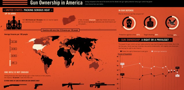
 Armed to the Teeth was from GOOD magazine. I liked this infographic because the data was clearly shown in an understandable way. Right off the bat, you can see that Americans, on average, have more guns than any other country in the world. You can also see that 62% of Americans who own a gun have a second one as well. This infographic even shows the reasons why Americans say that they own guns. I thought this infographic did a good job because it showed a ton of information about gun ownership in America, but it did not become confusing or cluttered.
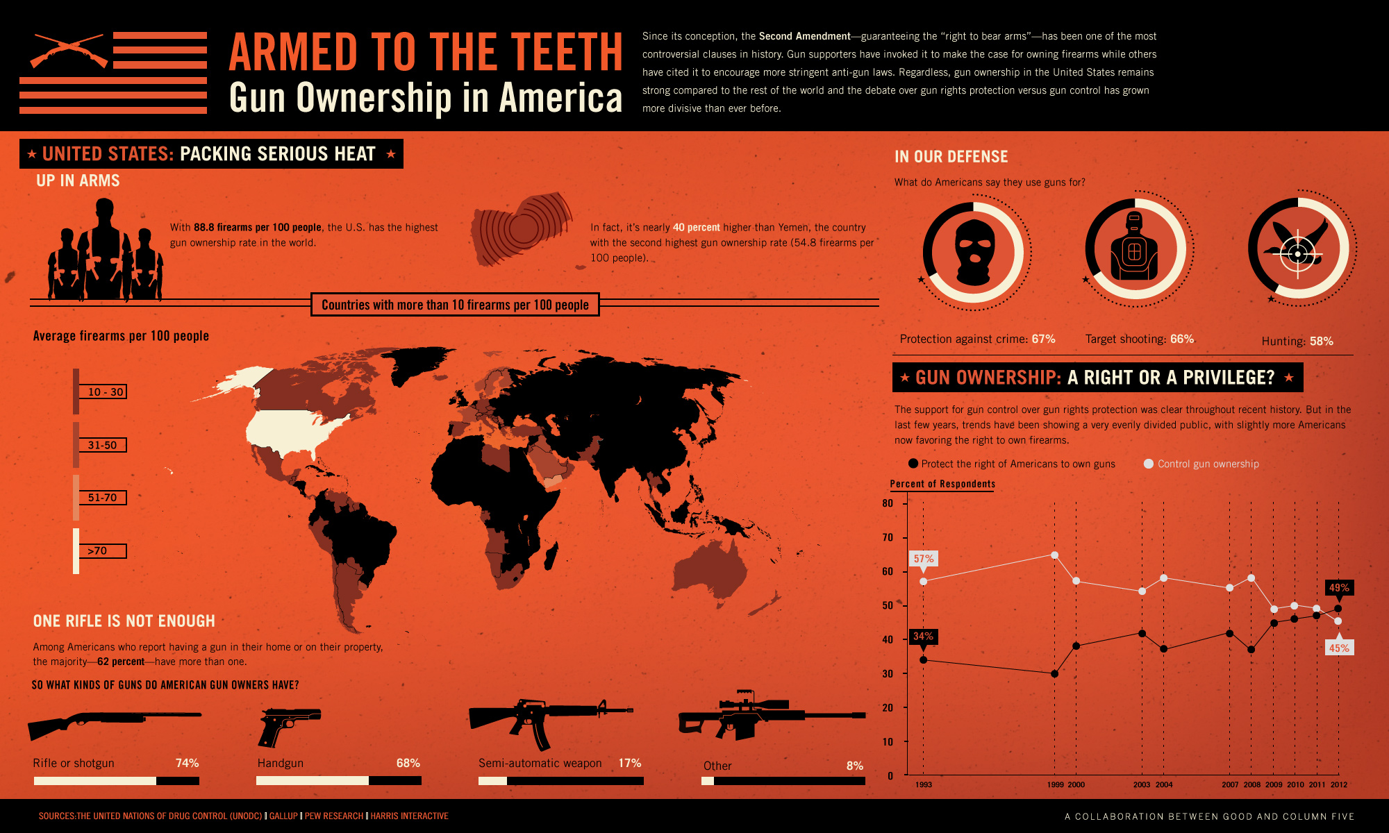
Looking at these infographics made it clear that for me, the most important aspect of an infographic is that it is visually appealing and not cluttered or confusing. It is easy to show a ton of data, but what is harder is to show it all in an understandable way. These two infographics stood out to me because I thought they did a good job of this.
I really liked “The World as 100 People” infographic. I was really surprised by a lot of the distributions. I like how each section was clearly separated and the colors were very simple and somewhat consistent for each section (for example grey was used for the not able to read, no religion, no college education). It helps the reader draw connections.