
WWF Ecosystem Awareness Campaign
http://desigg.com/40-creative-inspiring-ads-from-wwf/
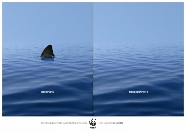
The World Wildlife Fund’s ad campaign to advocate for keeping ecosystems safe is simple yet effective. The campaign consists of many images similar to the above image, a photo with an animal(generally an unpopular animal ie. bats, vultures, bugs) then the same image without the animal. The campaign was presented in print and reached out to the any readers who might come across the ad in publications. Additionally, this ad campaign has received a lot of attention online because of its simplicity and effectiveness. Anyone who is reading about effective ads may come across this campaign in an analysis article.
It is appealing to the audience’s pathos. It wants the audience to be aware that while wildlife can be scary; however, a world with no wildlife is even more disconcerting. It wants the audience to realize that ecosystems are extremely fragile and just because an animal is not cute or tame does not mean it is not important to an ecosystem.
The juxtaposition of the exact same images with the only difference being the sharks existence creates a very straightforward message that the lack of wildlife is the only difference. The white text is extremely clear and stands out on the blue background. Using the statements “horrifying” and “more horrifying” uses repetition to draw the comparison between the two images. Because the statements lack details and explanation, the images are what tell the story. Having the text in all caps draws even more attention and makes the statements seem more important. The small statement at the bottom “Exploiting the ecosystem also threatens human life” tells the audience the main message yet it is extremely small compared to the rest of the ad which allows the images to remain the focal point.
Sources
http://desigg.com/40-creative-inspiring-ads-from-wwf/
http://helptheworldwildlifefund.blogspot.com/
I thought this was a very powerful visual argument. I liked the simplicity of the advertisement, and felt that having fewer words and a simple picture conveyed a stronger message. I also thought it was interesting how the creator decided to use such tiny text for the visual argument. I’m not sure if the creator chose to do that to simplify the advertisement or to emphasize the picture rather than the text. Either way, It effectively raised my attention about the preservation of ecosystems, and made me want to learn more.